NETFLIX 2019
WHAT TO SEE NEXT
Lydia Yan
zy1562@nyu.edu
Netflix is a streaming media company that has a huge impact on the world media industry, there are over 167 million subscribers all around the globe which made it the king of streaming. The company is famous for its great contents and it is attracting more and more audiences through its well-established programs.
Netflix is attracting more and more people through its recommendation system which brings up a better user experience. As the book Technologies of Vision: The War Between Data and Images by Steve F. Anderson introduces, Netflix aims to take the user viewing history as the database to analyze the aesthetic preferences of its users.
This visualization is to show you what you may see next according to the video category. It will stand on different viewpoints, and show you a simplified function of the recommendation system.
NETFLIX 2019
WHAT TO SEE NEXT
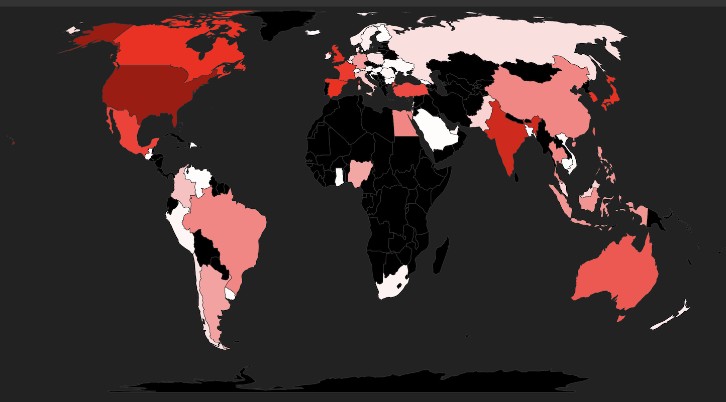
This data visualization represents the production country of each show in the dataset.
According to the amount of the shows each country has produced, the color of the country continent varies from white to red, the country with no production record is colored black. You can check on each country's most produced category by hover over each country's shape.
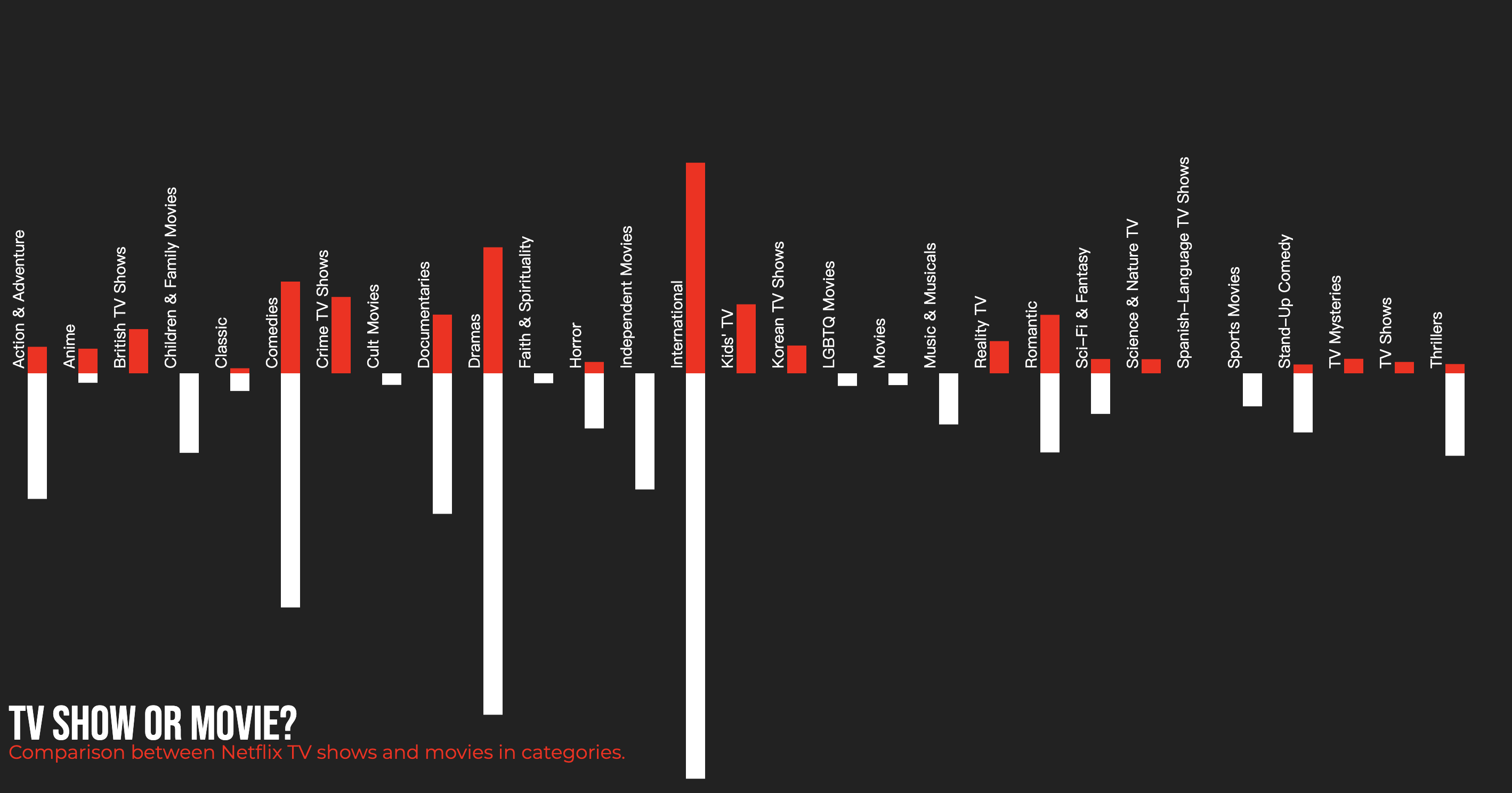
This data visualization reveals the categories of Netflix shows by divide the shows into two section: TV Shows and Movies.
According to Flixable, Netflix show gallery, the total amount of TV Shows and Movies have decreased in 2019 comaring to 2018. While TV Shows increased and movies decreased, the movies avaliable on Netflix are still greater than the number of TV Shows.
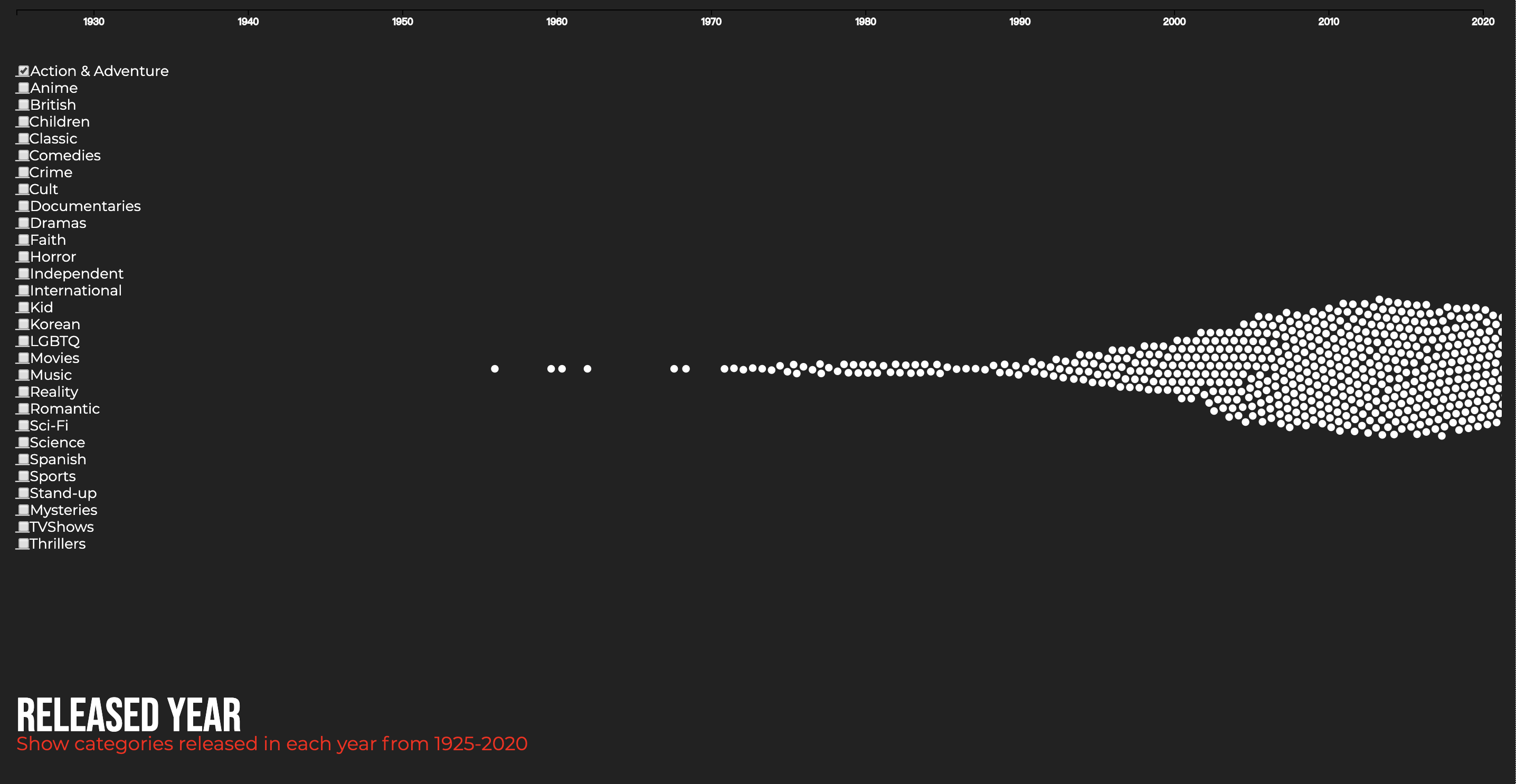
According to the dataset, the shows avaliable on Netflix can date back to 1925. This graph visualizes the show categorized in different years.
Click on the category checkbox above to find out more.
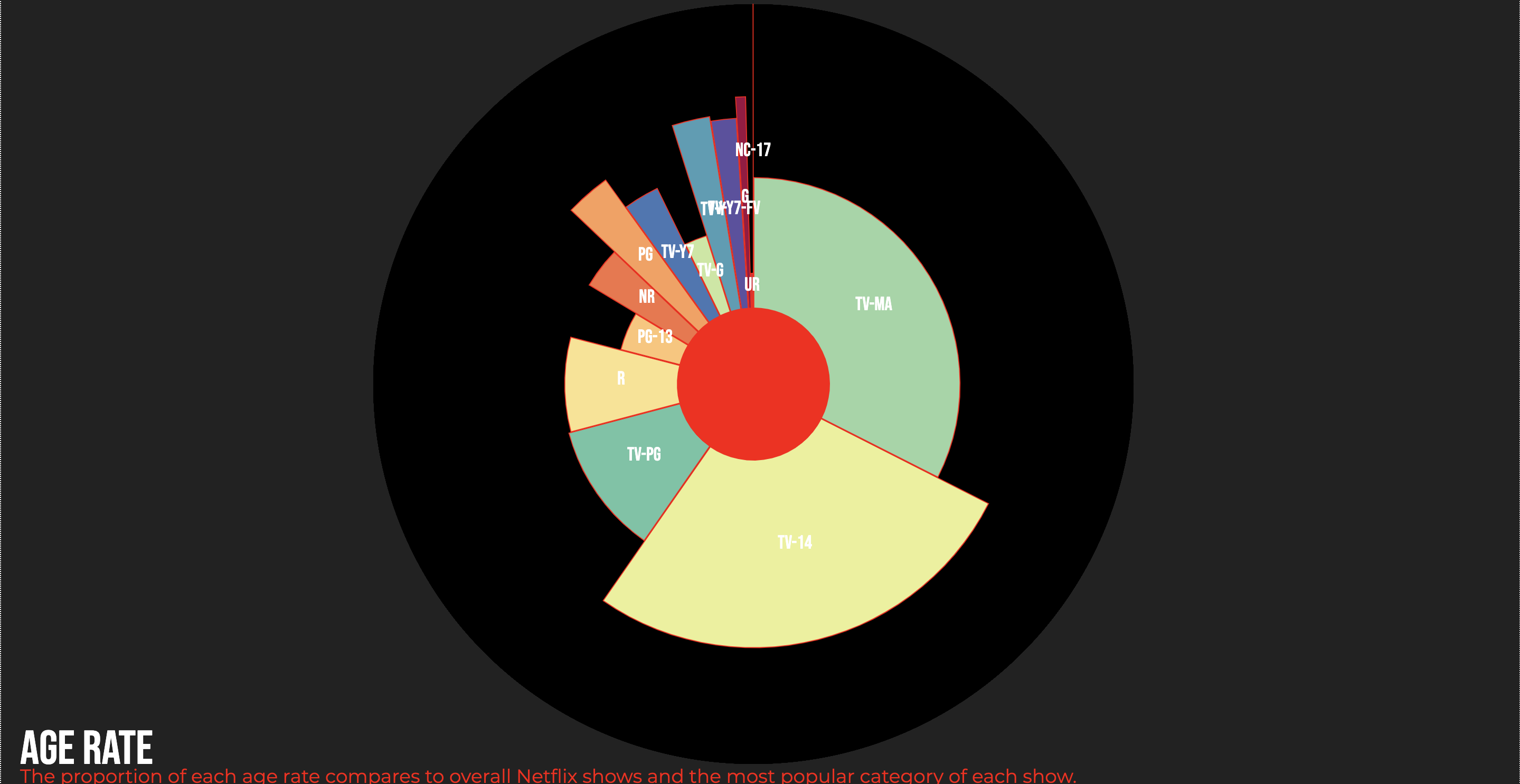
This data visualization represents the age rating of Netflix shows.
The pie chart represent all the shows avaliable on Netflix in 2019.
The angle of the sectors represent the portion of each age rating.
The colored area is the category that takes up the most space in the corresponding age rating.
Comparing between the radius of the black circle and the radius of the colored section, you can see the exact portion of each most categorized shows.
Hover to see more details.